Pivara Skopje: Designing the 100-Year Anniversary Logo
A Tribute to Legacy and Future
About the Project
A logo is more than just a visual symbol. It carries the weight of a brand’s history, values and vision for the future. For Pivara Skopje, a company that has been a part of Macedonia’s social and cultural fabric for a century, the 100-year anniversary logo needed to honor the past while setting the stage for the next chapter.
The goal was to create a timeless, meaningful and forward-looking logo that encapsulates 100 years of trust, responsibility, growth and sustainability—a logo that not only marks a milestone but also conveys Pivara’s ongoing commitment to innovation and excellence.

Challenge
- The logo needed to reflect Pivara’s deep-rooted presence in Macedonian society while embracing modern brand values such as sustainability and long-term partnerships.
- While the heritage elements of Pivara’s identity had to remain recognizable, the design also needed to signal progress and a forward-looking vision.
- The anniversary logo had to be more than a number—it needed to tell a story, carrying a clear corporate message and reinforcing Pivara’s lasting impact on the market and the community.
Approach
- The logo had to seamlessly integrate:
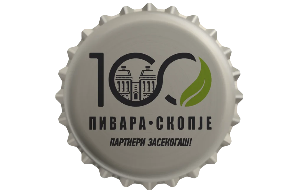
- The number 100 – a bold, clear representation of the milestone.
- Historical elements – the iconic Pivara Skopje towers, symbolizing legacy, longevity and trust.
- Sustainability focus – a green leaf, representing Pivara’s commitment to environmental responsibility and sustainable growth.
- A powerful brand message – instead of a generic “100 Years Celebration,” we crafted a concise and meaningful statement: “Partners Forever”, reinforcing the strong relationships built over a century.
- Timeless design innovation – the two zeros in “100” were replaced with the infinity symbol (∞), signifying continuity, lasting partnerships, and a vision for the next 100 years.
- We took inspiration from Pivara’s heritage while introducing modern design elements to represent its evolving mission and ambitions.
- Every detail—from the historical references to the sustainable messaging—was meticulously placed to ensure cohesion and brand alignment.


Result
- The final design successfully captured the essence of the brand, balancing heritage, trust and forward-thinking values.
- The “Partners Forever” tagline and the infinity symbol transformed the logo from a simple anniversary mark into a statement of long-term commitment.
- By incorporating both historical and sustainability elements, the logo served as a bridge between the company’s rich legacy and its modern aspirations.
- The anniversary logo was more than a tribute; it set the tone for Pivara Skopje’s next 100 years, inspiring employees, partners and consumers alike.